Website accessibility is an essential part of modern web design and development in 2026. A website should not only look professional and work well on different devices, but it should also be usable by people with different abilities. Visitors may use screen readers, keyboards, voice controls, screen magnification, or other assistive technologies to browse the web. If your website creates unnecessary barriers, some users may struggle to access your content or complete important tasks.
The good news is that making a website accessible does not always require a complete redesign. Many accessibility improvements involve simple changes to your content, HTML, navigation, forms, colors, images, and interactive elements. Whether you run a small business website, blog, online store, portfolio, or web application, you can start improving accessibility step by step.
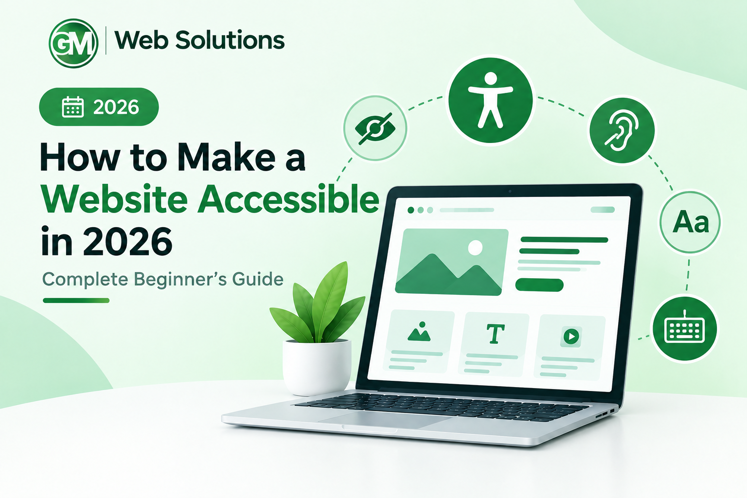
In this beginner-friendly guide, you will learn what website accessibility means, why it matters in 2026, how WCAG 2.2 works, and what practical steps you can take to create a more accessible website.
What Is Website Accessibility?
Website accessibility means creating websites that people with different abilities can access, understand, navigate, and interact with.
Accessibility is especially important for people with visual, hearing, physical, speech, cognitive, and neurological disabilities. However, accessibility improvements can also help people without permanent disabilities.
For example, captions can help someone who is deaf or hard of hearing, but they can also help someone watching a video in a quiet environment without sound. Keyboard navigation can help someone with a motor disability, but it can also be convenient for users who prefer keyboard shortcuts.
An accessible website removes unnecessary barriers instead of expecting every visitor to interact with the website in exactly the same way.
Some common accessibility considerations include:
- Providing useful alternative text for images
- Making navigation possible with a keyboard
- Using clear headings and page structure
- Maintaining sufficient color contrast
- Creating accessible forms
- Adding captions to videos
- Providing visible keyboard focus
- Using descriptive links and buttons
- Writing clear and understandable content
- Supporting assistive technologies
The goal is simple: make your website usable by as many people as reasonably possible.
Why Does Website Accessibility Matter in 2026?
The web has become an essential part of everyday life. People use websites to shop, study, communicate, apply for jobs, access financial services, book appointments, read news, and interact with businesses.
This makes accessibility more than a design preference.
It is part of creating a better digital experience.
Accessibility is also receiving increasing attention from governments and organizations around the world. The European Accessibility Act began applying in June 2025 to certain products and services, including areas such as e-commerce and banking. This has made digital accessibility an even more important consideration for businesses operating in affected markets.
There is another major reason accessibility matters in 2026: websites are becoming more complex.
Modern websites often include animations, pop-ups, chatbots, video players, online forms, interactive menus, AI-generated components, and other dynamic features. Every additional component creates another opportunity for accessibility problems.
That is why accessibility should be considered during the design and development process instead of being treated as something to fix at the very end.
Understanding WCAG 2.2
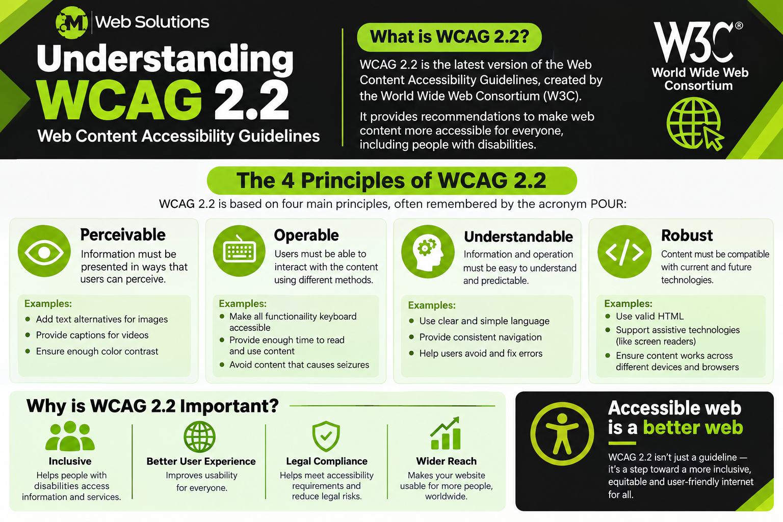
If you want to improve website accessibility, WCAG is one of the most important standards to understand.
WCAG stands for Web Content Accessibility Guidelines. It is developed by the World Wide Web Consortium, commonly known as W3C.
WCAG 2.2 provides recommendations and testable success criteria for making web content more accessible. It is organized around four fundamental principles:
Perceivable: Users should be able to perceive the information presented on a webpage.
Operable: Users should be able to navigate and interact with the website.
Understandable: Users should be able to understand the content and how the interface works.
Robust: Website content should work reliably with different browsers, technologies, and assistive technologies.
These four principles are often referred to as POUR.
WCAG 2.2 also defines three levels of conformance:
- Level A
- Level AA
- Level AAA
Level A represents the minimum level of accessibility requirements. Level AA adds more requirements and is commonly used as a practical target for websites. Level AAA represents the highest level but is not always practical for every website or situation.
Understanding these principles gives beginners a useful foundation for accessibility testing.
Start With a Clear Page Structure
A well-organized webpage is easier for everyone to understand.
One of the simplest ways to improve accessibility is to use headings correctly.
Your main page title should normally use an H1 heading. Major sections can use H2 headings, while subsections can use H3 headings.
For example:
H1: How to Make a Website Accessible in 2026
H2: What Is Website Accessibility?
H2: Why Does Website Accessibility Matter?
H2: How to Make Your Website Accessible
H3: Improve Keyboard Navigation
Headings are not simply a way to make text bigger or smaller. They communicate the structure of your content.
Screen reader users can use headings to understand the organization of a webpage and quickly move between sections.
Avoid choosing heading tags only because their default size looks good. Use them according to the actual structure of the content, then use CSS to control their appearance.
Add Useful Alt Text to Images
Images can communicate important information, but not every visitor can see them.
Alternative text, commonly called alt text, provides a text-based description for meaningful images.
For example, if an article contains a picture of a developer working on a website, an appropriate alt text might be:
Web developer testing a website on a laptop
Avoid meaningless descriptions such as:
image123.jpg
The purpose of alt text is not to describe every tiny visual detail. It should communicate the important information or purpose of the image.
Decorative images are different. If an image does not provide meaningful information, it may not need a descriptive alternative.
A useful question is:
What would the visitor miss if this image could not be seen?
The answer can help you decide what information belongs in the alt text.
Make Your Website Keyboard Accessible
Not every visitor uses a mouse. Some people navigate websites entirely with a keyboard because of physical limitations or because they use assistive technology. You can perform a simple keyboard accessibility test yourself.
Put your mouse aside and press the Tab key.
Move through your website and check whether you can access important elements such as:
- Navigation menus
- Links
- Buttons
- Search fields
- Forms
- Pop-ups
- Dialog boxes
- Interactive controls
You should also be able to see where the keyboard focus is located.
If you press Tab but cannot tell which element is selected, the experience can quickly become confusing.
A visible focus indicator is an important part of keyboard-friendly navigation.
Use Descriptive Links
Links should tell users where they will go.
Generic phrases such as “click here,” “read more,” and “learn more” can provide very little information when viewed independently.
For example, instead of:
Click here to learn about website accessibility.
Use:
Learn more about website accessibility best practices.
Instead of:
Read More
Use:
Read our guide to accessible website design.
Descriptive link text is particularly helpful for screen reader users who navigate through links separately from the surrounding content.
It also makes your content easier for all visitors to scan.
Improve Color Contrast
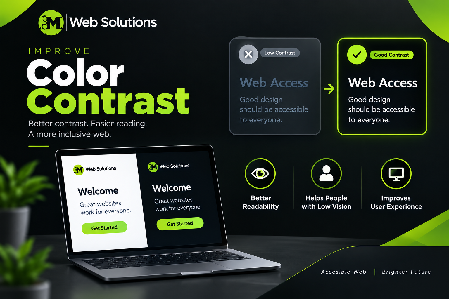
Good color choices are important for both accessibility and readability.
Text that has very little contrast against its background can be difficult to read, especially for people with low vision.
Check the contrast of:
- Body text
- Headings
- Navigation links
- Buttons
- Form labels
- Placeholder text
- Icons
- Important interface elements
For example, light gray text on a white background may look minimal and modern, but it can be difficult to read.
You should also avoid relying on color alone to communicate information.
If a form error is indicated only by changing a field to red, some users may not understand what the problem is.
Include a clear text message explaining the error.
Create Accessible Forms
Forms are an important part of many websites.
Visitors may use forms to contact a company, create an account, subscribe to an email list, make a purchase, or request information.
Every important form field should have a clear and meaningful label.
For example:
Email Address
[Enter your email address]
is much clearer than presenting an unlabeled input field.
Error messages should also help users understand what went wrong.
Instead of:
Invalid input.
Use:
Enter a valid email address.
If a password has specific requirements, explain those requirements clearly.
An accessible form should help users understand:
- What information is required
- What format they should use
- What went wrong
- How they can fix the problem
Clear forms reduce confusion and make the overall user experience better.
Add Captions to Videos
Video content is now common across websites. If your website includes videos, captions can make the content more accessible to people who are deaf or hard of hearing.
Captions can also benefit people who:
- Watch videos without sound
- Are in a noisy environment
- Have difficulty understanding spoken audio
- Speak a different first language
If your video contains important visual information that is not explained in the audio, you may also need to consider additional alternatives such as audio descriptions or a suitable text alternative.
Accessibility is not about adding captions simply because a checklist says to do so. The goal is to make the information in the video available to people who may experience it differently.
Use Semantic HTML
Semantic HTML means using HTML elements according to their actual purpose.
For example, use:
<button>for buttons<a>for links<nav>for navigation<main>for the primary content<header>for header content<footer>for footer content<form>for forms
Avoid turning generic elements into interactive controls when a native HTML element already provides the required behavior.
For example, a real <button> is generally a better choice than creating a clickable <div> and adding extra code to make it behave like a button.
Semantic HTML provides useful information to browsers and assistive technologies.
It can also make your code easier for developers to understand and maintain.
Use ARIA Carefully
ARIA stands for Accessible Rich Internet Applications. ARIA can be useful when you are building custom components that cannot be properly described using standard HTML alone. However, adding ARIA everywhere does not automatically make a website accessible.
For beginners, a useful rule is:
Use native HTML whenever possible, and use ARIA when it is actually necessary.
Incorrect ARIA can sometimes make an interface more confusing rather than more accessible.
Before adding an ARIA attribute, ask whether a standard HTML element can already provide the same functionality.
Simple, semantic HTML is often the best starting point.
Make Interactive Elements Easy to Use
Buttons, links, menus, sliders, dialogs, and other interactive elements should be easy to identify and operate.
Use clear labels that describe the action.
For example:
Download the Accessibility Guide
is much more useful than:
Click Here
Interactive controls should also provide appropriate focus behavior and should not suddenly move users somewhere unexpected.
WCAG 2.2 introduced additional criteria related to areas such as focus visibility, target size, accessible authentication, consistent help, and other aspects of interaction.
These updates reflect how modern web interfaces have evolved.
Make Your Website Accessible on Mobile
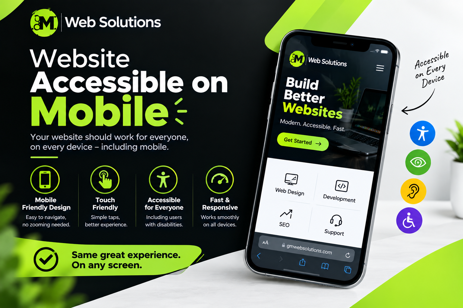
Accessibility does not stop at desktop computers.
People browse websites using smartphones and tablets every day. Your website should remain usable when the screen becomes smaller.
Check whether users can:
- Read the content comfortably
- Open navigation menus
- Tap buttons
- Complete forms
- Scroll through the page
- Use interactive controls
- Understand the page structure
Buttons and other controls should have enough space to interact with comfortably.
Avoid layouts where important content becomes hidden, overlaps other elements, or requires unnecessary horizontal scrolling. Responsive design and accessibility should be considered together when building a modern website.
Avoid Unnecessary Auto-Playing Content
Unexpected audio or rapidly moving content can make a website difficult to use. For example, imagine opening a webpage and suddenly hearing a video playing in the background. This can be particularly disruptive for screen reader users or people browsing in a quiet environment.
If your website contains moving, flashing, or automatically changing content, provide appropriate controls where necessary. Users should have reasonable control over content that could distract them or interfere with navigation. Accessibility also includes avoiding design choices that can cause physical reactions for susceptible users.
Test Your Website With Accessibility Tools
Once you have made accessibility improvements, testing is essential.
Automated tools can identify many common problems and are a useful starting point for beginners.
Browser-based tools such as Lighthouse can check various accessibility factors and highlight potential issues.
Depending on the page, automated testing may identify problems involving:
- Image alternative text
- Color contrast
- Form labels
- Page structure
- ARIA
- Interactive elements
Automated testing saves time, but it has an important limitation.
A high accessibility score does not automatically mean that your website is fully accessible.
Some accessibility problems require human judgment and real interaction.
That is why manual testing should always be part of your process.
Perform Manual Accessibility Testing
After running an automated audit, test the website yourself.
Start by navigating the page with only your keyboard.
Press Tab repeatedly and observe the focus order.
Check whether:
- Every important control is reachable
- Focus is visible
- Menus can be opened and closed
- Forms can be completed
- Dialogs can be closed
- You can move through the entire page without getting stuck
You can also zoom the page and test it at different screen sizes.
If possible, test the website with assistive technologies such as screen readers.
The combination of automated testing and manual testing gives you a much better understanding of the real accessibility of your website.
Be Careful With AI-Generated Code
AI has changed the way websites are created in 2026.
Developers can ask AI tools to generate complete webpages, components, CSS, JavaScript, and even accessibility fixes.
This can save considerable time.
However, AI-generated code should still be reviewed and tested.
An AI tool may generate an interface that looks perfect but has problems such as:
- Incorrect HTML semantics
- Poor keyboard navigation
- Missing focus management
- Incorrect ARIA
- Inaccessible custom controls
- Missing labels
- Poor contrast
The 2026 discussion around web accessibility and AI also highlights the importance of verifying AI-generated code instead of assuming that it is accessible simply because an AI tool says it is.
Use AI as a development assistant, but keep human testing in the process.
Common Website Accessibility Mistakes
Many accessibility problems come from small decisions that seem harmless during development.
Common mistakes include:
- Using images without appropriate alt text
- Removing visible keyboard focus
- Creating buttons from generic elements
- Using vague link text
- Depending only on color
- Using very low-contrast text
- Creating forms without clear labels
- Adding unnecessary ARIA
- Ignoring keyboard users
- Assuming an accessibility plugin fixes everything
- Relying only on automated testing
You do not need to solve every accessibility issue at once.
Start with the problems that affect basic navigation and access to important content.
Then continue improving your website over time.
A Practical Website Accessibility Workflow
If accessibility feels overwhelming, use a simple workflow.
- Start with your homepage.
- Run an accessibility audit.
- Review the issues.
- Fix the obvious problems first.
- Check the headings.
- Review your images.
- Test keyboard navigation.
- Check color contrast.
- Test forms.
- Review buttons and links.
- Then open the page on a mobile device.
After fixing the homepage, move to another important page.
This approach allows you to learn as you work instead of trying to understand every accessibility requirement before making your first improvement.
Website Accessibility Checklist for 2026
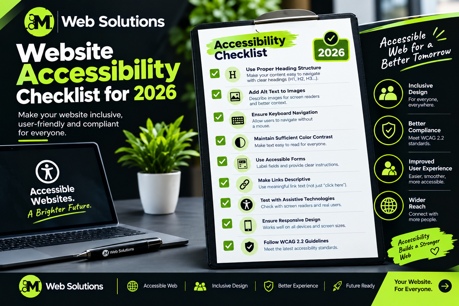
Before publishing a new page, ask yourself:
- Does the page have a logical heading structure?
- Is the main heading clear?
- Do meaningful images have appropriate alt text?
- Can the website be navigated using only a keyboard?
- Is keyboard focus visible?
- Are links descriptive?
- Are buttons clearly labeled?
- Do form fields have proper labels?
- Are error messages understandable?
- Is the text sufficiently contrasted against its background?
- Are videos provided with captions when needed?
- Does the page work properly on mobile?
- Can users interact with important controls without a mouse?
- Have you tested the page with an automated accessibility tool?
- Have you also performed manual testing?
This checklist will not replace a full accessibility evaluation, but it gives beginners a practical starting point.
How Website Accessibility Can Support Better SEO
Accessibility and SEO are not the same thing, but several good practices overlap.
- Clear headings make content easier to understand.
- Descriptive links create better navigation.
- Alt text provides useful information about images.
- Semantic HTML creates a clearer document structure.
- Mobile-friendly design improves usability.
- Readable content helps visitors understand your information.
However, you should not make your website accessible only because you expect better search rankings.
The primary purpose of accessibility is to remove barriers for real users.
When accessibility, usability, performance, and SEO are considered together, you can create a stronger overall website experience.
What Should Beginners Do First?
If you are completely new to accessibility, do not try to memorize the entire WCAG specification.
- Start with the basics.
- Pick one page.
- Check its headings.
- Review the images.
- Test keyboard navigation.
- Look at the color contrast.
- Check the forms.
- Run an accessibility audit.
- Then manually test the page.
Once you become comfortable with these steps, you can move on to more advanced topics such as focus management, accessible authentication, custom widgets, ARIA patterns, and assistive technology testing.
The official W3C WCAG documentation is a useful resource for learning the requirements and understanding how they apply to real websites.
Final Thoughts
Website accessibility is an important part of creating a modern website in 2026. An accessible website should allow users with different abilities to access information, navigate pages, interact with controls, complete forms, and understand content without unnecessary barriers.
You do not need to redesign your entire website in one day. Start with the fundamentals. Use semantic HTML, provide useful alt text, improve keyboard navigation, maintain good color contrast, create accessible forms, add captions to videos, use descriptive links, and test your website regularly.
Automated tools can help you find common problems, but manual testing is equally important. If you use AI to build or improve your website, review the generated code rather than assuming it is automatically accessible.
WCAG 2.2 provides a strong framework for understanding modern web accessibility, and learning its principles can help you make better decisions during design, development, and content creation.
The most important step is simply to start. Choose one page, identify one accessibility problem, fix it, test the result, and continue improving. That is how you can build a more inclusive, user-friendly, and genuinely accessible website in 2026.